How Often Should We Clean Our Office Carpet?
December 21, 2019
Tips That Explain How To Match Your Carpet With Your Curtain
December 21, 2019Carpet Colors To Avoid Using In The Office

While it is true that you can use all kinds of fine colors in your office carpet, you have to be careful when finding a quality look for your space. The problem with there being such a huge variety of colors to choose from is that you will have to be cautious because there is no way how every single option can fit into your office. You have to be certain when finding office carpets that you find a color that is conducive to your workplace. There are many options that you have to avoid in you are going to have something that is interesting.
Primary Colors
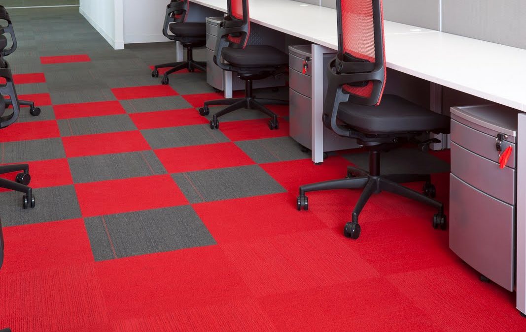
Red, yellow and blue are the primary colors that you can find on just about any color wheel. These are colors that are used as a basis for various different tones as they are mixed. The thing about these primary colors is that they are a real foundation but at the same time they must be avoided on their own. While they might be attractive, they can be rather challenging. These might sound useful for carpets but if you stuck with office carpet in one of these three primary colors then you will not have the best possible carpets to work with. These can cause anyone’s eyes to become tired rather quickly. In fact, while the room might start to look interesting at first, it will create an antiquated look rather quickly that will not create any sense of interest in who looks in on it.
Whatever Mixes With Your Brand
You should reconsider if you want to have carpet that might match up with the color of your company logo. There is no way how you can predict if you’re going to use the same color in that brand a few years from now. Sticking with something that is neutral regardless of the appearance of the physical brand for your company is always a smart idea to think about.
Anything Overly Dark
While you might think that dark colors can be rather interesting, you have to avoid extremely dark colors. These include choices like black or navy blue. These dark tones might be a real issue to your place but they are ones that have to be reviewed well with regards to the overall appearance of whatever you require. The problem with darker carpet colors is that they often cause a space to look smaller than it really is. This small space often makes it harder for different activities to be held in a spot because people have the impression that there is less space in an area than what one can actually use.
Extremely Detailed Palettes
While you might think that it is not all that fun to have just one color for your carpet in your office, it may be the best option for you to stick with. The problem with having a carpet that features a highly detailed palette is that it will cause your carpet to look a little too textured. This could cause some distractions in the workplace. Sticking with a solid color is typically the best thing to do with regards to giving your carpet the look that you are trying to get.
Anything That Mixes In With Your Equipment
This point will vary based on the office you are in but it helps to avoid anything that might match up with the equipment that you are using. For instance, if you have a bunch of dark blue servers in your office space then you should try and avoid a dark blue carpet. This is to make sure the servers will stand out and will not mix in with the carpet. This is to allow the footprint of the carpet to be a little more visible.
Metallic Colors Don’t Work Either
You might want to watch for metallic colors like grey. The problem with grey is that it gives off a plain look that is not all that interesting or unique. The fact that it might clash with whatever you are using in your office in terms of equipment does not help either. You need to avoid these bothersome metallic colors just to keep the room looking nice and attractive. You can’t just assume that any carpet is going to work in your office. Be certain that you understand what you want to get out of your carpet so you will have an option to use that will fit in quite well in your office.


